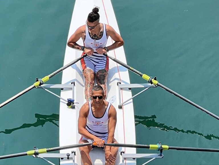
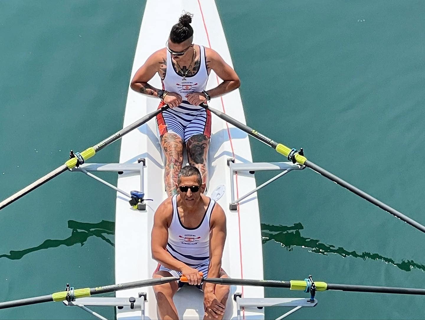
A young rowing team with big ambitions needed a visual identity that could hold its own—on local waters steeped in tradition, and on international stages defined by performance.
Context
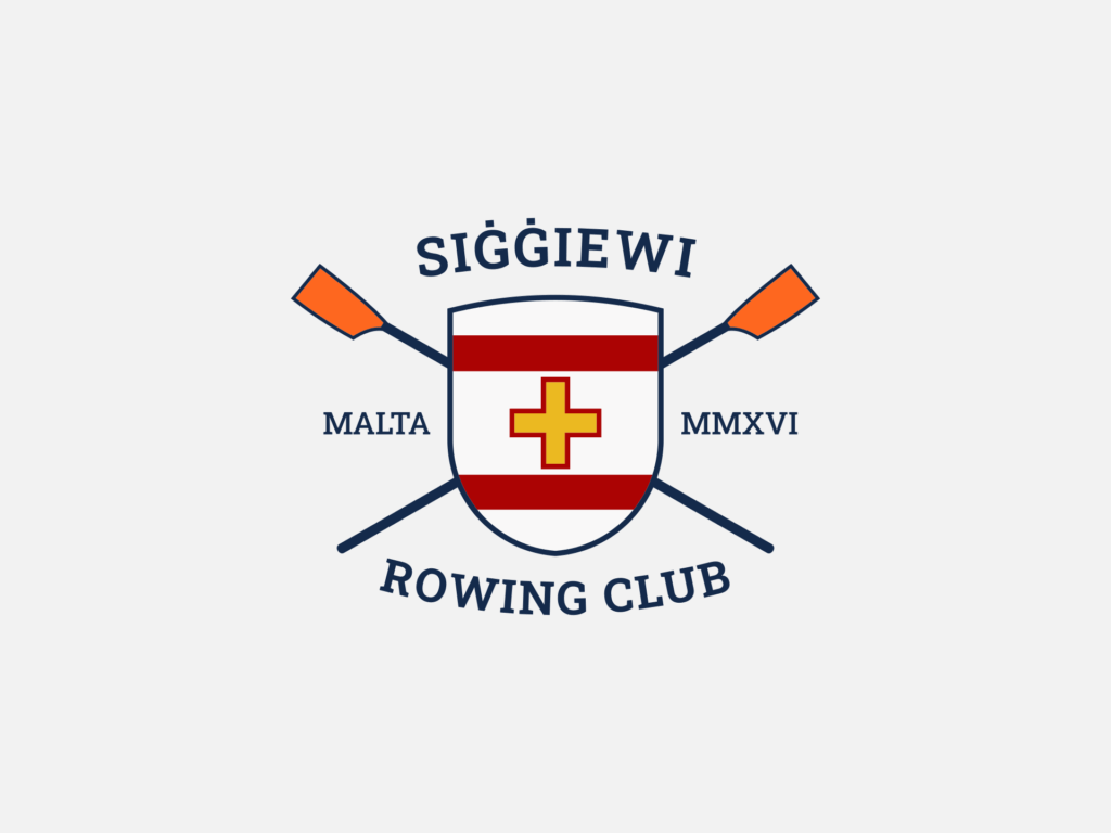
Siggiewi Rowing Club was a new presence in a very old sport. Locally, it needed to stand beside historic rowing clubs steeped in Maltese tradition, all of which had long-established colours and emblems. Internationally, it was entering a completely different space—one where gear, oars, and performance visuals carried most of the recognition. The team had already chosen orange as its core colour and had begun using the Siggiewi crest in early materials. Now, on the cusp of official competitions, it needed to formalise and scale its identity fast—without losing what it had already started building.
Fit & Intent
This was a team that moved quickly and thought ahead. The identity wasn’t starting from scratch—it needed to sharpen what already existed. The aim was to create something that could hold up in the Grand Harbour without clashing with rival clubs, and at the same time stand out clearly in international regattas where visibility, cohesion, and confidence matter. The intent was to build recognisability across every setting—gear, boats, flags, media—without getting bogged down in heritage mimicry or over-design.
Direction
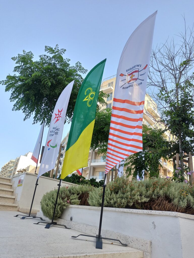
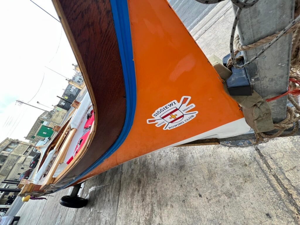
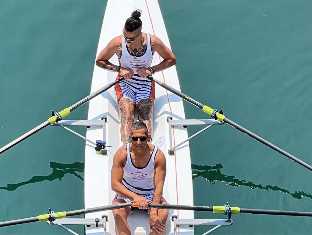
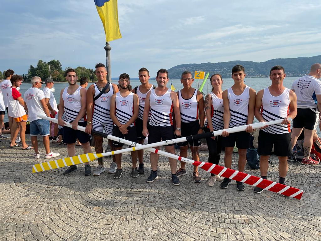
The approach focused on formalising, not reinventing. The Siggiewi crest was retained and refined, and the team’s chosen orange became the foundation for a clearer, bolder identity system. Angled stripes were introduced as a visual nod to oars cutting through water—dynamic, simple, and immediately applicable across scales. The system needed to move easily between stitched gear, fibreglass hulls, and digital layouts, so every visual decision was stress-tested against where and how it would be seen.
Outcome
Siggiewi Rowing Club now has a full-colour identity that is both grounded and distinctive. The logo system has been applied across boats, team gear, flags, and digital materials. The angled stripe motif provides an expandable graphic language that’s recognisable on the water and on the world stage. The team now shows up with presence—unmistakably Siggiewi, whether racing along the Grand Harbour or lining up internationally.